online illustration portfolio
The Great Portfolio Redesign of 2026
⚞ 2026-01-17 ⚟
I built this website about 9 months ago. It's been really nice to have an online home for my art - away from social media platforms and all the vulnerabilities that come with depending on them. Most exciting of all, of course, is the fact that with enough coding knowledge, it can look like anything I want! While having a "proper" online portfolio had been a goal of mine for a while, what finally got me to actually build it was coming across Kaylee Rowena's portfolio template. To be honest, my knowledge of HTML and CSS at the time was more or less limited to what I'd learned from firsthand experience making pages on Neopets at 13 years old... so the simplicity and included explanations of how it worked were a big help. After making use of that and googling how to do a lot of things, I ended up with this:
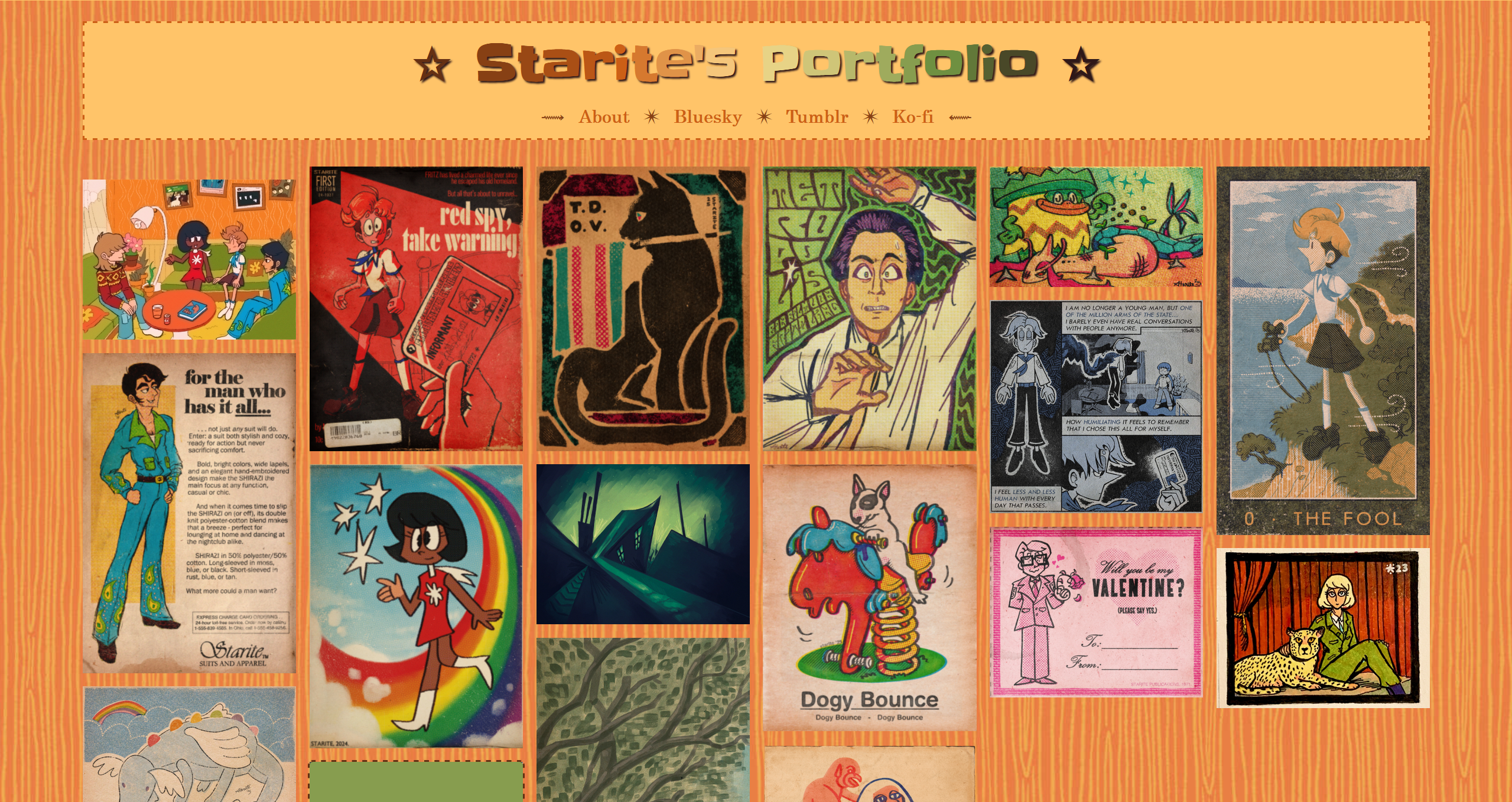
Besides changing the basic format to fill most of the screen, I also adapted it so that each image would link to a separate page explaining a little about the piece and how I made it. It was fun! I was really proud of it! It showed me that I could make a website and customize it to my heart's content, even though it was kind of hard and something I hadn't done in over a decade.
And yet... it felt like there was more I could do with it. I love old-school, unpolished web design, but as time went on, mine started to feel a bit bland. And I love quirkiness, too, but I felt a little awkward showing my site to people who might've expected something more serious. It was also really, really orange. So I started drafting a new layout - something I could more confidently show to the world without sacrificing what made the old layout fun. I decided to make it my big project for the time being and drafted this in Clip Studio Paint without worrying about how easy or hard it'd be to make with what I knew:
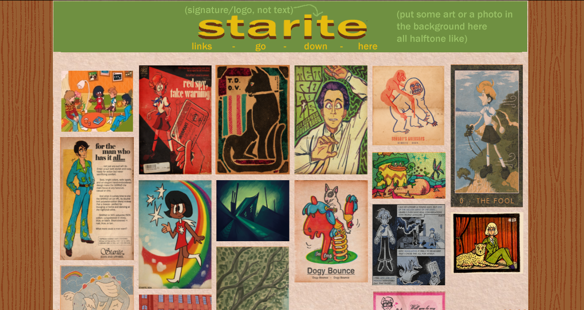
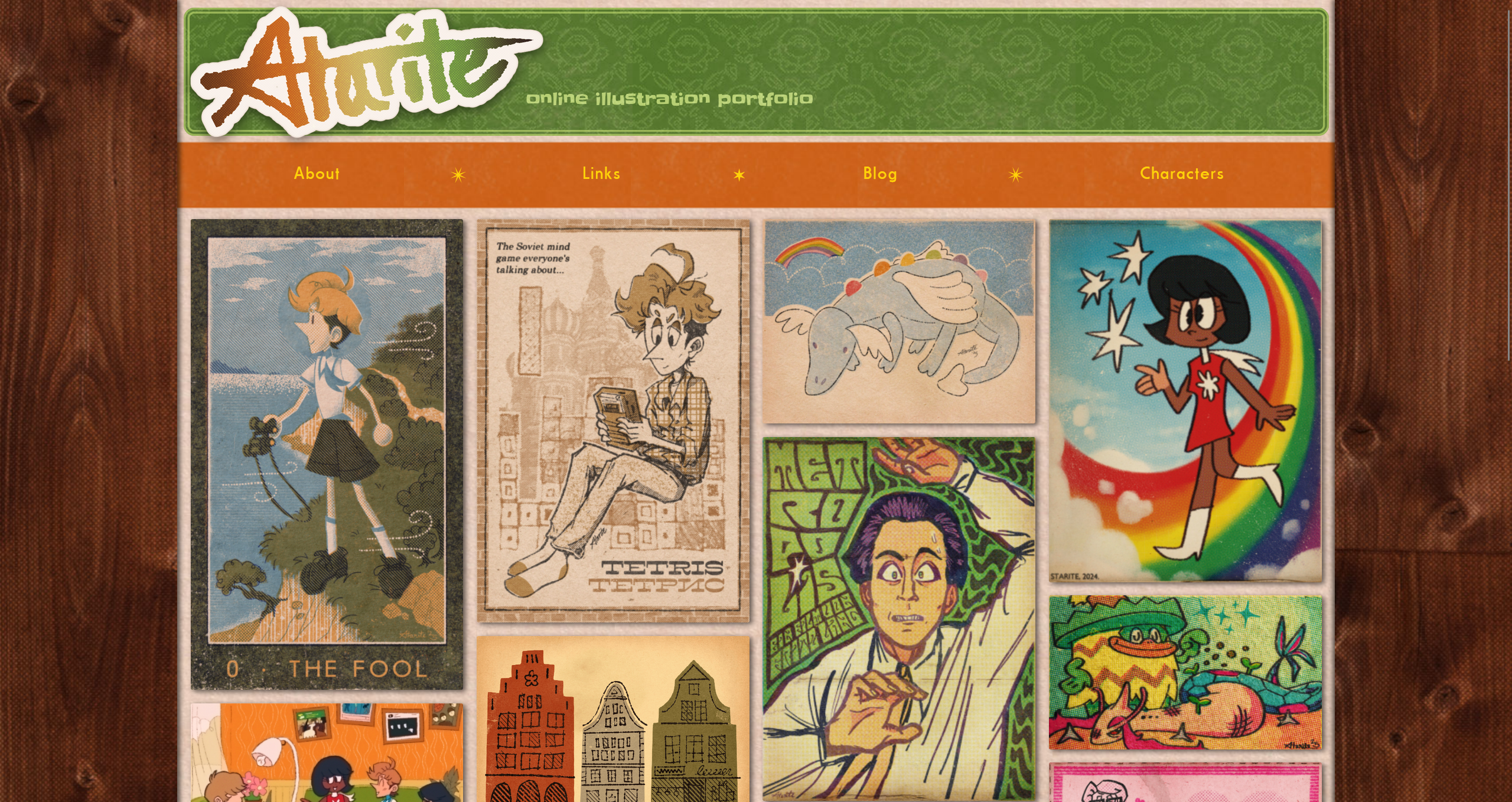
A color scheme easier on the eyes was a must - in this draft, the old orange is completely gone, and even in the final product it's limited to the navbar and footer. The off-white paper texture often used in my art would provide a more neutral background color that wouldn't clash with the images so much. Using my own hand-drawn signature for the title would add a more personal touch. And of course, it was imperative that the website be decked out in wood paneling.
Ultimately, to get the layout I wanted, I kind of frankensteined together the portfolio code mentioned earlier and a layout template generated by Sadgrl's Layout Builder. The result is... a mess of spaghetti code and inline CSS that really doesn't need to be inline, but it works! And I think it looks pretty cool.
Some tidbits:
- When you hover over each image in the portfolio, the green overlay uses a transparent blend mode instead of being completely opaque like it used to be. This was a gigantic pain in the ass to get working properly since the blend mode kept getting applied to the title links as well as the images, making them almost unreadable. Because of this, the text and background box are actually a separate effect that appears and disappears at the exact same time as the green overlay.
- The signature at the top was originally meant to be centered like in the draft, but when I added it to the header, it appeared all the way to the left. I decided to keep it like this because I found it more visually interesting. It also wiggles a little if you hover over it
- Almost every element on the website is textured somehow. The body, navbar, and text boxes use subtle paper textures, and the header uses an adapted version of a pattern I made inspired by old wallpaper. The side paneling is edited from a royalty-free image, and I layered a halftone effect onto it for that added retro charm. I love making art that feels like you can reach out and touch it, and this website is no exception :)
Things I want to add:
- Blog main page with links to each entry. (Actually, if you're reading this, they've already been added. Bullet point canceled.)
- Character pages with images and descriptions of each character - it'd be fun to link to these from the descriptions of pieces that feature them. They could also function as a sort of rudimentary miniature wiki, but that has the potential to be expansive enough to need a whole site to itself.
Overall, I'm really happy with how this came out! There's still parts that need to be fixed and pages that need to be built. But hey... the creative process is never really over, is it?